Who Counts? The Politics of Covid-19 Data
Numbers are not, in fact, objective
In what ways has the COVID-19 pandemic exacerbated existing inequalities in the US? Building on the work of activists living with HIV, journalist and scholar Steven Thrasher argues that the US has created a “viral underclass” – “a population harmed not simply by microscopic organisms but by the societal structures that make viral transmission possible.” Legal scholar Kimberlé Crenshaw described COVID-19 even more starkly: “One more chapter in the annals of American racial power, in which the bodies of some are sacrificed en masse for the privilege and convenience of others.”
Public discourse has focused heavily on failures of the US federal response, with less attention paid to states’ specific responses. But states and governors are now in the spotlight. The federal executive has shifted blame and responsibility to states, which have a longstanding prerogative to protect health and safety of their residents, and the virus has spread unevenly throughout the country. One way to explain some of this variation is that some government actors use data while others ignore it.
Many public commentators have called for a “data-driven” response. But this framing takes data itself for granted. It fails to acknowledge the situated human choices that lie behind all data. That is, counting projects are always contested, and COVID-19 is no exception. What numbers do politicians use to communicate? And what numbers do they gloss over?
Since the first cases in each of their states, both New York Governor Andrew Cuomo and New Jersey Governor Phil Murphy have been holding near-daily press conferences, heavy on policy updates and Covid-19 statistics. Like his more visible New York counterpart, Murphy adeptly wields “the aesthetics of authority” – but their communication strategies differ.
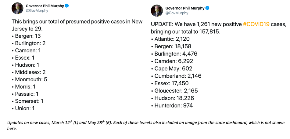
While Governor Cuomo had largely stopped providing statistics on Twitter by mid-March, Governor Murphy recirculates them heavily. He tweeted some version of the figure below nearly every day between March 12th and June 24th, and he shares several dozen tweets during a typical daily press conference. Many of these tweets use various quantitative templates – such as models predicting future cases, charts showing hospitalizations over time both in total and by region, maps showing doubling rates by county, and comparisons to neighboring states along key metrics. But precisely which templates he uses, and their order, has varied since he began these regular press conferences in mid-March. One thing that has remained constant: despite requiring hospitals to report demographic data in mid-April, he himself only presents state- and county-level data.
Five years ago, I noted that “numbers become authoritative because so few people feel confident in interpreting them.” And I’m far from the only one to make this observation. In Trust in Numbers, historian of science Theodore Porter writes about the administrative need for accountability that has driven so much of the quantification we see in government today. And in an interview on the BBC just this May, statistician David Spiegelhalter described the UK government’s statistical communication about Covid-19 as “number theater” that doesn’t take into account the “strengths and limitations” of the data. For statisticians, numbers allow us to quantify our uncertainty; for politicians and perhaps much of the public, numbers are certainty.
Even among current governors, Murphy prides himself on being data-driven. In fact, he has leaned hard into an ideology that “the numbers speak for themselves,” going so far as to adopt the slogan “data determines dates.” My research seeks to understand how the numbers speak, and for whom.
Please tell us what you think in the Comments section. We’d love to hear your thoughts! Want to collaborate or support this idea? Get in touch with us at info@knology.org.
Related Reading
This essay was adapted from a proposal. While I’ve edited out most of the academic background, it’s important to acknowledge the many others who have shaped my thinking around these questions. In addition to the sources linked in the text, I’ve been thinking with:
Benton, A. (2016). Risky business: Race, nonequivalence, and the humanitarian politics of life. Visual Anthropology, 29(2), 187-203.
Briggs, C.L. (2003). Why nation-states and journalists can’t teach people to be healthy: Power and pragmatic miscalculation in public discourses on health. Medical Anthropology Quarterly, 17(3), 287-321.
Briggs, C.L. (2005). Communicability, racial discourse, and disease. Annual Review of Anthropology, 34, 269-291.
Covid Tracking Project. (2020). Assessment of the CDC’s New Covid-19 Data Reporting. May 18, 2020.
Erikson, S.L. (2012). Global health business: The production and performativity of statistics in Sierra Leone and Germany. Medical Anthropology, 31(4), 267-284.
Garcia, N.M., López, N., & Vélez, V.N., Eds. (2018). QuantCrit: Rectifying quantitative methods through critical race theory. Race, Ethnicity, & Education, special issue 21(2).
Gershon, I. (2015). What do we talk about when we talk about animation. Social Media + Society, April-June, 1-2..
Keleman Saxena, A. & Johnson, J.L. (2020, May 31). Cues for ethnography in pandamning times: Thinking with digital sociality in the Covid-19 pandemic. Somatosphere.
Lieberman, E. (2020). Risk for “us,” or for “them?” The comparative politics of diversity and responses to AIDS and Covid-19. Items.
Patel, N.V. (2020, May 7). The U.S. has no idea how to manage all the testing data it’s collecting. MIT Technology Review.
Sangaramoorthy, T. (2012). Treating the numbers: HIV/AIDS surveillance, subjectivity, and risk. Medical Anthropology, 31(4), 292-309.
Sangaramoorthy, T. & Benton, A., eds. (2012). Enumeration, identity, and health. Medical Anthropology, special issue, 31(4).
Sangaramoorthy, T. & Benton, A. (2015). From #EbolaBeGone to #BlackLivesMatter: Anthropology, misrecognition, and the racial politics of crisis. Savage Minds.
Silvio, T. (2010). Animation: The new performance? Journal of Linguistic Anthropology, 20(2), 422-438.
Thrasher, S. W. (2019). "Tiger Mandingo," a tardily regretful prosecutor, and the "viral underclass." Souls, 21(2-3), 248-252.
Wolfgram, M. (2016). Science talk and scientific reference. Annual Review of Anthropology, 45, 33-44.
Zuberi, T. (2000). Deracializing social statistics: Problems in the quantification of race. Annals of the American Academy of Political and Social Science, 568, 172-185.
Photo by Brian McGowan on Unsplash