Numbers in the News: Inflation Explanations
This edition of the Numbers in the News series explores ways to support audience understanding of economic reporting. The results reported here are based on a single experiment in a larger sequence of experiments.
Can the news help you learn statistics? In this series of studies, we're asking people to read, watch, or listen to different versions of a news report that contains numbers, visualizations, or both. Then we're asking them a series of questions about the credibility of that news report and some of the inferences they drew from it. These are the two dependent variables common to all our studies. In addition, we're asking people to rate the story's relevance along four ever-widening social scales: me, my close family and friends, people who live near me, and society as a whole. For details about Numbers in the News and the hypothetical model that underlies this research, click here.
The A/B/C Test
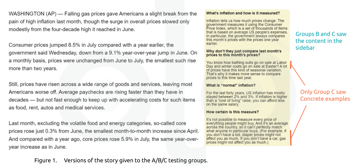
In this test, we experimented with sidebar content explaining the basics of inflation indicators, specifically the Consumer Price Index, to accompany a quantitatively-dense news story. We used an Associated Press story published in August 2022 (Rugaber, 2022), which used multiple numbers to describe changes in inflation:
- the year-over-year CPI values for July and August 2022,
- the adjusted month-over-month change, and
- core inflation (excluding food and energy prices).
Based on past focus group discussions, we knew that although audiences are interested in inflation as a topic that impacts their daily lives, they find the way it is presented in news hard to understand.
In addition to testing the original story (which we labeled Version A), we also tested two modifications to this (Figure 1). Version B preserved the original text of the story and added a sidebar with basic questions and answers about inflation and the Consumer Price Index. Version C included the original story, the sidebar, and a series of examples that illustrated the sidebar's descriptions. If respondents accessed the survey using a smartphone, the sidebar content was presented directly below the main story text.
Key Findings
Social Relevance
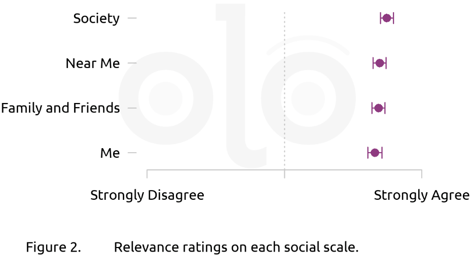
In past tests, audiences rated the content they saw (on topics including COVID, unemployment, and policing) as more relevant to "society as a whole" than to "me," "my family and friends," or "people near me." For the inflation story, there were no significant differences in social relevance ratings. Regardless of the version they read, audiences believed the story to be as relevant for themselves as they did for others. Figure 2 shows the average (mean) ratings for each social scale. These ratings did not differ based on which version of the story respondents saw.
When asked why they responded as they did, most respondents indicated that inflation is something that "affects everyone," since everyone needs to pay for goods and services. It was also common for respondents to mention higher prices they and those around them were facing, particularly for food or gas.
Credibility
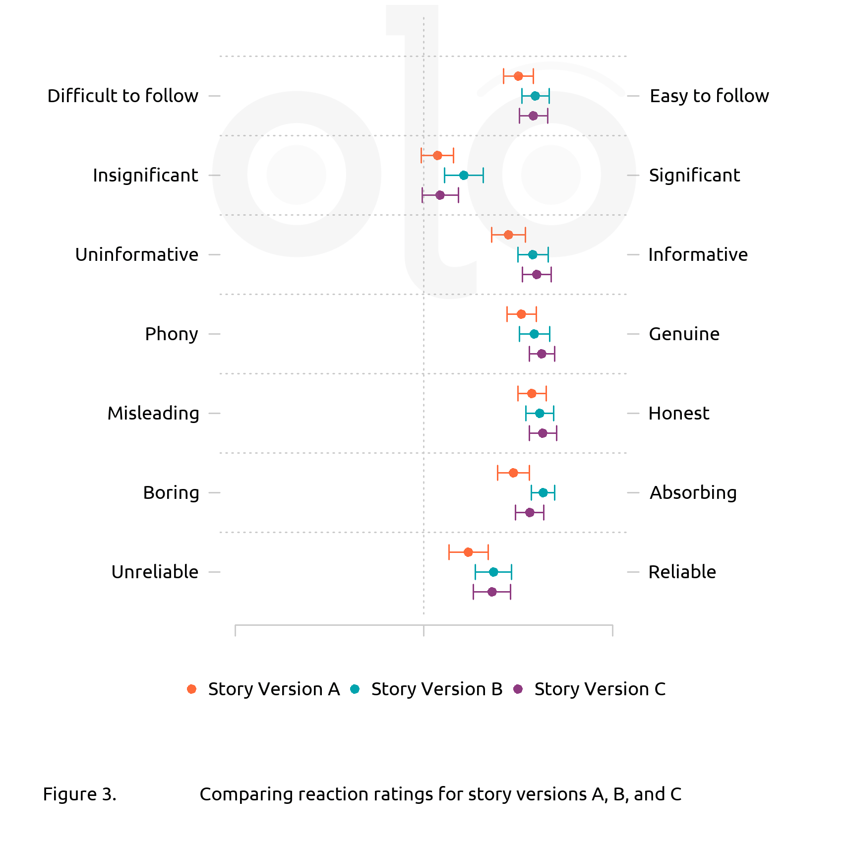
To understand how credible readers thought the story was, we asked them to grade the version they read in terms of the criteria listed below in Figure 3. As this indicates, there was some small variation in audience reactions to the three stories. Specifically, respondents who read one of the versions with the sidebar explainer gave the story higher credibility ratings than those who read the original story. Which version of the sidebar respondents saw had a very small effect. Figure 3 shows the average (mean) ratings for each reaction scale.
We observed the same pattern when we modeled respondents' inferences using the hypothetical model described in https://knology.org/article/numbers-in-the-news/. As in past tests, perceived relevance had a larger impact on credibility than differences in story version, but seeing a version with a sidebar also had a noticeable effect.
Inferences
To understand inferences audiences drew from the story, we asked them to rate how well they felt they understood the story (on a scale from "Not at all" to "Completely"), and how serious they felt the issue described was (on a scale from "Not at all" to "Extremely"). For seriousness, respondents who saw version B (sidebar without examples) gave a higher rating than those who saw versions A or C. Ratings for the understanding question did not vary significantly between versions based on a simple t-test, but using the full model which accounts for effects of individual variables, perceived topic, relevance, and credibility, the story versions which included a sidebar were associated with a higher rating (Version B slightly more so than C).
To test understanding beyond self-assessment, respondents were asked whether, based on the story they read, prices "changed very little" from June to July 2022. While the story did state outright that this was the case, because it presented month-to-month and year-over-year rates together, we anticipated that this might confuse those unfamiliar with how inflation is measured. However, the proportion of respondents answering correctly was roughly equal, regardless of story version.
When asked what information helped them answer the above question, nearly all respondents quoted either the statement that "On a monthly basis, prices were unchanged from June to July" or that "core prices rose just 0.3% from June, the smallest month-to-month increase since April." Only 7 respondents specifically mentioned the sidebar as helping them answer the question.
Respondents were also asked to explain, in their own words, what "Consumer prices jumped 8.5% in July compared with a year earlier" meant. Those who saw a sidebar were more likely to include language that indicated they understood how the CPI was calculated—whether by naming it specifically or mentioning "average" prices, a set of "common" goods, a basket of goods and services, etc. Around 10% of respondents offered a subjective judgement, such as "the economy is in bad shape," rather than an explanation.
As in past AB tests, the story's perceived relevance had a larger effect on credibility and inferences than differences in story version.
Recommendations
- Sidebars are a valuable tool for explaining complex topics. Consider developing reusable evergreen sidebars for topics that come up frequently, and making them available for all articles with this content.
- Audiences will put in the effort to understand something they see as personally relevant, even if it's complex. Make sure readers understand how what you're writing about affects them.
- Provide plain-language explanations for terms your audience may not be familiar with.
- Be careful to clarify the difference between similar metrics, such as increases "from June [to July]" versus "in July [compared to July of last year]."
References
Rugaber, C. (2022, August 10). U.S. inflation at 8.5 percent, slips from 40-year high. AP News, in PBS NewsHour. https://www.pbs.org/newshour/nation/u-s-inflation-at-8-5-percent-slips-from-from-40-year-high
Funding
These materials were produced for Meaningful Math, a research project funded through National Science Foundation Award #DRL-1906802. The authors are solely responsible for the content on this page.
Photo by Alexander Grey at Unsplash