Numbers in the News
In this series, we’re looking into whether different ways of reporting on numbers improves either public understanding of statistics or judgments of news credibility
About the Study
Can the news help you learn statistics? In this series of studies, we’re asking people to read, watch, or listen to one of two versions of a news report that contains numbers, visualizations, or both. Then we’re asking them a series of questions about the credibility of that news report, as well as some of the inferences they make.
The connection between learning statistics and credibility might not seem obvious, but it’s important. Journalists often use numbers and statistics to cultivate credibility among audiences. Simultaneously, audiences deem stories as more credible if they include more numbers, whether or not the numbers are reliable. In these cases, statistics give people a feeling of certainty about what they’re seeing. However, there can be a breakdown in this system when statistics are deceptive or inappropriately applied. If people have a clear understanding of statistics, they will be able to discern the difference between responsible and irresponsible uses and, by extension, identify which stories are credible and which should not be trusted. We are developing a model that connects all these pieces, shown in detail below.
In our study, we’re controlling for a number of demographic variables that might be related to how audiences perceive numbers in the news, including age, education, and political alignment. Since many of today’s most consequential numbers are related to the COVID-19 pandemic, whether about public health or economic consequences, we’re also controlling for people’s belief in conspiracy theories about the pandemic, following a Pew study on this topic.
With each test, we’re reflecting on the meaning of the results for journalists and other science communicators. We hope this series can help them use numbers and statistics in ways that build audiences’ reasoning skills.
The Tests & Results
You can find more about each test in the links below.
- Caveats & Credibility - What is the effect of providing caveats about insufficient COVID-19 testing? Read the article >>
- Estimates - How audiences interpret the "official" statistics reported in news stories, and the effects of explaining how these estimates are calculated. Read the article >>. We also looked at misunderstandings in more detail. Read the article >>.
- Margin of Error - Do different ways of visualizing margin of error help people understand what the numbers mean? Read the article >>
- Social Desirability - How do audiences reason about trends in behavior based on national polls? Read the article >>
- Quantification Without Numbers - How do people make sense of words like many and large? Read the article >>
- Inflation Explanations - How do audiences rate the credibility and relevance of news stories about inflation? And what inferences do they draw from these? Read the article >>
How the Tests Work
First, we show participants one of several versions of a news story or image, including the published version. Each of the results articles above outlines the specific changes we made to the stories
Next, we ask participants to assess their reactions to the news story. We also ask them to assess the social relevance of the story on different levels - the extent to which topic is relevant to “me,” “my family” up to society as a whole.These questions will be the same for all of the tests.
We also ask people to make estimates or calculations that depend on the story text to judge how well they understood calculations in the story.
We then asked a bunch more questions to help us understand more about the participants. These questions looked at:
- How frequently people consume news about the COVID-19 epidemic
- The types of sources people said they would get additional information from
- People’s comfort with uncertainty (measured through the Need for Closure score; Roets & Van Hiel, 2011; Kruglanski, Webster, & Klem, 1993)
- Belief in conspiracies surrounding the virus’s origins
- Demographic characteristics, including: gender, educational attainment, population density in a geographic area, political alignment, race and ethnicity, state of residence, age, and risk factors for COVID-19
The Nitty Gritty: How We Analyze the Data
In our analysis, we’re treating the story version as the independent variable, reactions and estimates as dependent variables, and everything else is treated as covariates. Shown below is a hypothetical model showing the different factors that we believe influence how audiences respond to news, and the relationships between them.
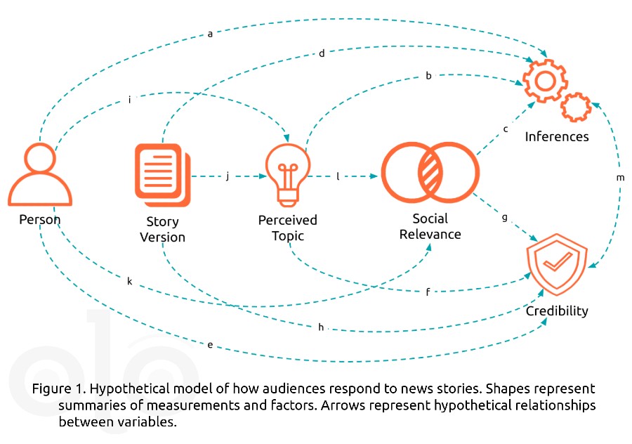
The icons in the figure represent some of the events, factors, and judgements involved in encountering and making sense of numbers in the news, and the paths (arrows) represent the relationships between those events, factors, and judgements. There are a few things to note about some of the icons used in the model. Person summarizes each individual’s demographics, political affinities, and other variables. Perceived Topic summarizes the results of applying a text mining algorithm to responses to the question “What is the topic featured in the excerpt?” Social relevance summarizes the assessments described above. Credibility summarizes participants' assessment of seven aspects of credibility. Finally, Inferences summarizes participants’ answers to quantitative reasoning questions.
To understand our hypotheses, follow the lettered paths. For example, arrow “a” shows that inferences may depend in part on the person, but that relationship also depends on what the person thinks the story is about (paths “i” to “b”) and the social relevance that the person assigns to the topic (paths “i” to “l” to “c”).
We simplify many of the demographic variables that are used in the analysis: We summarize gender and race/ethnicity in terms of privilege, comparing men and people who identified as white to those who selected other options. We categorize states by the level of restrictions in play at the time each survey is conducted, and collapse age and risk factors into a single risk variable for health-focused stories.
Want to hear more or have questions about the research? Let us know in the comments!
Funding
These materials were produced for Meaningful Math, a research project funded through National Science Foundation Award #DRL-1906802. The authors are solely responsible for the content on this page.
Photo by Crissy Jarvis on Unsplash