Numbers in the News: Margin of Error
This edition of the Number in the News series studies how audiences interpret margin of error values reported in news stories, and what inferences they make as a result. The results reported here are based on a single experiment in a larger sequence of experiments.
Can the news help you learn statistics? In this series of studies, we’re asking people to read, watch, or listen to different versions of a news report that contains numbers, visualizations, or both. Then we’re asking them a series of questions about the credibility of that news report and some of the inferences they make from that presentation. These are the two dependent variables common to all our studies. In addition, we are asking people to assess the relevance of the story topic to four ever-widening social scales: me, my close family and friends, people who live near me, and society as a whole. For details about Numbers in the News and the hypothetical model that underlies this research, click here.
The A/B/C/D Test
In this test, we looked at different ways of visualizing data in news stories. We used data from a NewsHour poll on perceptions of police fairness. The original news story included two visualizations: a comparison between demographic groups, and a comparison between two polling dates. Both displayed the polling results as percentages of responses in tables, with a note underneath mentioning the margin of error (MOE) – a measure of the uncertainty that comes from trying to make predictions about the general public from a subset of the population, as in polls.
We tested four methods of displaying the data: Version A was a table with a note underneath, as in the original story; Version B displayed the confidence interval (range of potential values) for each number within the table; Version C presented the numbers graphically with a note indicating margin of error; and Version D was both graphical and displayed confidence intervals for each number. Figure 1 shows these four versions of the demographic comparison. We used similar versions of each visualization to compare polls from two different dates. We received responses from 316 participants.
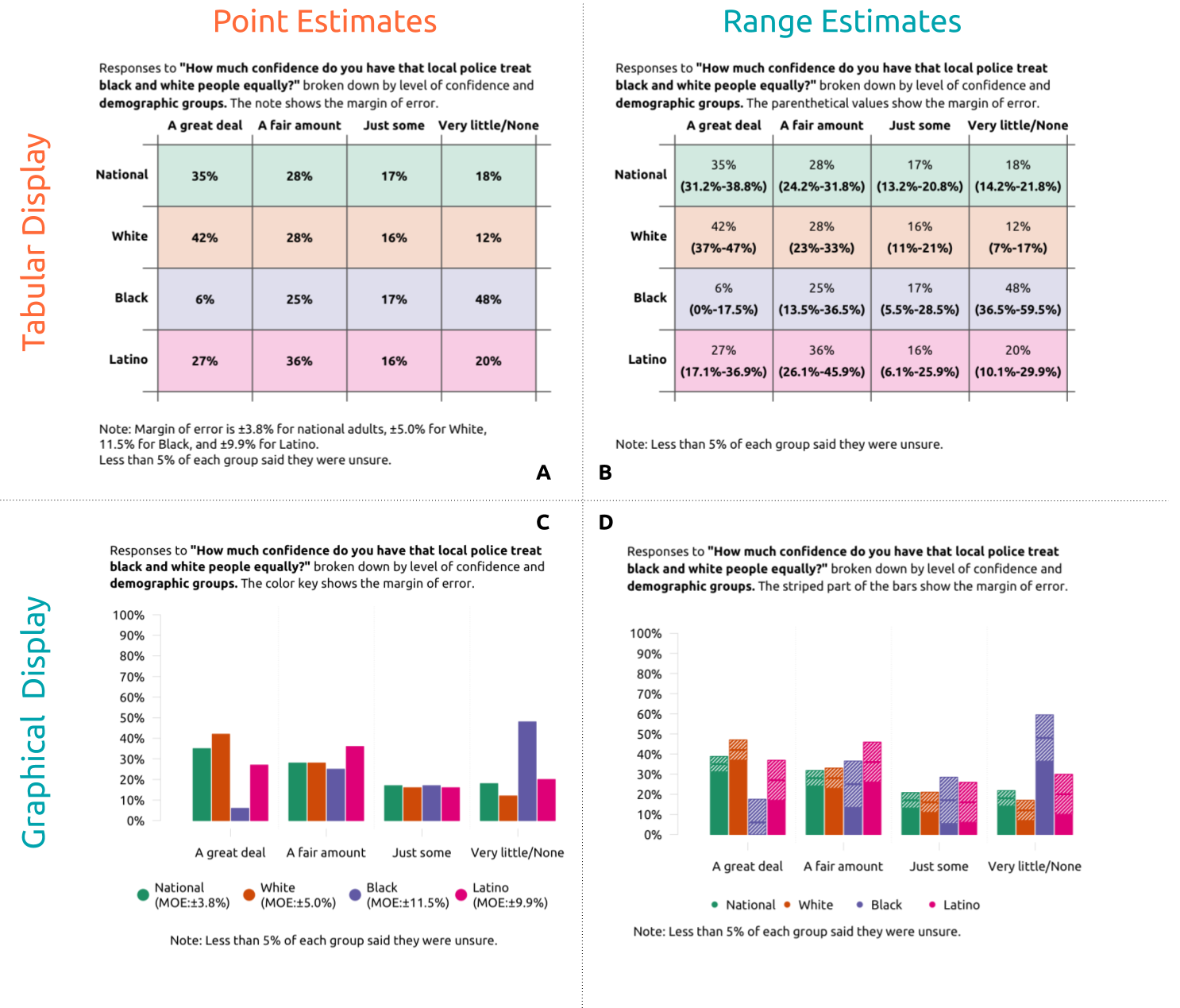 Figure 1. The different visualization styles to show margin of error presented in the survey.
Note: This figure shows four ways of presenting a comparison between demographic groups who were polled at the same time; we also presented a comparison across two polling dates in these four styles. That is, each participant saw two visualizations in a single style.
Figure 1. The different visualization styles to show margin of error presented in the survey.
Note: This figure shows four ways of presenting a comparison between demographic groups who were polled at the same time; we also presented a comparison across two polling dates in these four styles. That is, each participant saw two visualizations in a single style.
Grouping Variables
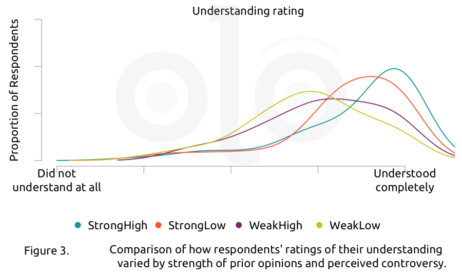
People’s prior opinions about a news topic can affect their reactions to the information reported. Specifically, people approach the information from different starting points and consider it to a greater or lesser degree when judging credibility and making inferences. We asked respondents how controversial they thought the story topic was, and how strong their prior opinions on the topic were. We grouped respondents based on whether their controversy and prior opinions ratings were relatively high or low (that is, above or below the median value).
We also asked respondents to define MOE in their own words. Some respondents demonstrated a functional understanding of MOE – essentially, they understood that it provides a range where the true value is likely to fall. These individuals generally made correct inferences no matter what visualization type they saw. Those who were unfamiliar with MOE, or misunderstood its meaning, benefited from seeing information presented in ranges rather than as points. We found that when that information was presented graphically, they made more accurate inferences.
Key Findings
Social Relevance
We asked respondents to rate the relevance of the topic at four ever-widening scales: “me”, “my close family and friends”, “people who live near me”, and “society as a whole.” Participants who held stronger prior opinions about the topic rated it as more relevant across all scales. No matter what visualization they saw, participants rated the topic’s relevance at similarly high levels at all social scales, and found the story more relevant to “society as a whole” than at other social scales. As in previous experiments, judgments about social relevance depended on the respondents, and not the version of visualization.
Credibility
We asked respondents to rate their reactions to the data visualization version they saw. These reactions capture particular aspects of the credibility that respondents ascribe to the data. After accounting for other personal variables, the visualization version did not make a meaningful difference in how people reacted.
Inferences
We asked survey participants what they understood about the polling results based on the visualizations they saw.
Comparing Groups
The first visualization compared demographic groups. After participants examined it, we asked them which group’s attitudes were most similar to adults overall, and why they thought this was the case. This question had one definitively incorrect answer, with all other answers justifiably correct: only the range for Black adults' responses did not overlap with the range for adults overall. This was apparent in all data visualization versions, and almost everyone, regardless of group, gave a “correct” answer.
In explaining why they chose their answers, most respondents gave causal explanations (e.g. “White communities rarely hear about police brutality”) rather than referring to their reasoning process (e.g. “I think white peoples’ views are closest to the national average but they influence the national average the most due to population size”). Since no version of the data visualization presented information about causes, respondents likely relied on their prior knowledge of the topic to answer the question. These results suggest that it might be easier to tease out reasoning if the topic is less familiar to respondents.
Comparing Over Time
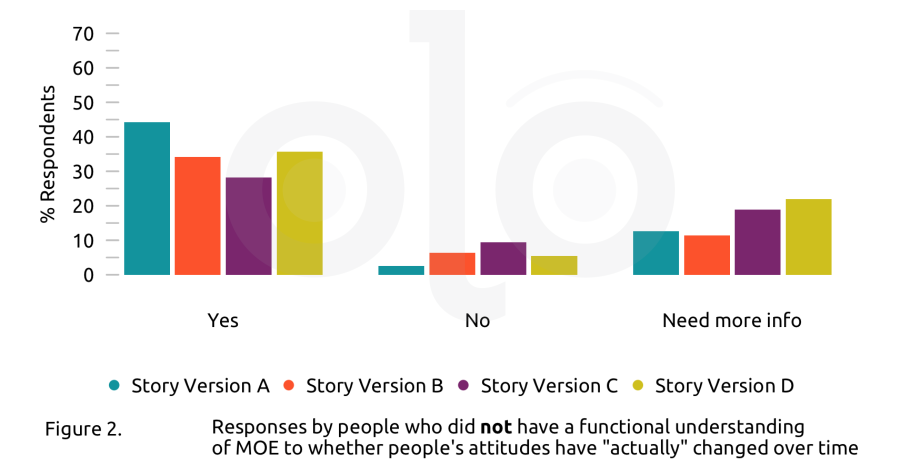
After participants examined the visualization which broke down survey responses by polling date, we asked them whether the visualization showed an "actual change" over time in people's attitudes. Because the difference fell within the MOE, we considered either “no” or “need more information” a correct response. For people who understood MOE, the type of data visualization did not make a meaningful difference in making the correct inference. But for people who did not, the changes made a difference (Figure 2): seeing the table with ranges or either kind of graph made them more likely to answer correctly.
We also asked them to explain their responses. In this case, 197 of the 316 participants outlined their reasoning, and the remainder provided what they thought were the ultimate causes of whether or not opinions had changed over time. At least 40 respondents referred to margin of error or statistical significance in their response, and about half of that number seemed to misunderstand what margin of error represents. For example, one respondent wrote, “There are different margins of error for each year. If they had similar margins of error, then maybe 2014 and 2020 would be more comparable.” This is a misunderstanding because the size of the margin of error is not relevant; the key point is whether the ranges overlap.
At least 54 respondents had questions about study methods. These ranged from simply wanting more information or questioning statistics in general, to wanting specific information such as p values or demographic data. Interestingly, a number of respondents argued that unless the exact same people were interviewed, these numbers could not tell us anything meaningful about change. These responses suggest that people may have a more basic misunderstanding about the purpose of sampling, which is to make inferences about the population rather than about the individuals included in the sample.
Self-Reported Understanding
Overall, there was little difference in self-reported understanding between respondents who saw data points vs. ranges, or tables vs. graphs. Respondents who did not have a functional understanding of MOE said they understood the “point” versions of the visualizations (A and C) better. It is important to note the mismatch between reported understanding and actual understanding. The visualization version (point version) that respondents reported as more “understandable” was not the same as the visualization (range version) which actually produced “correct” answers to the question about MOE. Other researchers have found that when information is presented in a way that requires more effort, people remember it better and are more likely to use it. Those who could define MOE showed no difference in understanding ratings.
Overall, people with stronger prior opinions said they understood the visualizations better, regardless of the version they saw. However, their responses to whether there was a “real change” in people’s opinions between the two polling dates (2014 and 2020) were no likelier to be correct than those of people with weaker prior opinions. This suggests that people with strong prior opinions were more likely to be overconfident in their understanding and may not look as closely at visualizations or numbers. We saw a similar, smaller effect for people’s perception of controversy. That is, those who saw the topic as controversial were more likely to believe they understood the figure, whether or not they interpreted it correctly.
Recommendations
- Showing ranges rather than single points helps people see the uncertainty in numbers. When reporting numbers in the news, emphasize the range rather than the point estimate. It doesn’t hurt people who already understand what margin of error is, and it helps those who don’t.
- Showing graphical visualizations rather than tables also seems to help people see relationships between numbers. Wherever possible, use graphical visualizations rather than numerals to help people gain a better understanding of the relationship between numbers.
- People’s preconceived ideas and opinions affect how they react to news and reported numbers. Continue to provide context in stories to help audiences think through the numbers.
- People seemed to misunderstand the purpose of sampling. It may be helpful to link to resource pages that provides basic explanations of commonly used statistical tools and terms.
Funding
These materials were produced for Meaningful Math, a research project funded through National Science Foundation Award #DRL-1906802. The authors are solely responsible for the content on this page.
Photo by Element5 Digital on Unsplash