Numbers in the News: Social Desirability Bias
This edition of the Numbers in the News series studies how audiences reason about trends in behavior based on national polls. The results reported here are based on a single experiment in a larger sequence of experiments.
Can the news help you learn statistics? In this series of studies, we’re asking people to read, watch, or listen to different versions of a news report that contains numbers, visualizations, or both. Then we’re asking them a series of questions about the credibility of that news report and some of the inferences they make from that presentation. These are the two dependent variables common to all our studies. In addition, we are asking people to assess the relevance of the story topic to four ever-widening social scales: me, my close family and friends, people who live near me, and society as a whole. For details about Numbers in the News and the hypothetical model that underlies this research, click here.
The A/B/C Test
In this test, we experimented with highlighting the idea of social desirability bias (the tendency of respondents to report behaviors that make them “look better”) when discussing self-reported poll data. We used an Associated Press story that reported on an AP-NORC poll on COVID prevention measures in January 2022 and March 2022. The original news story reported the percentage of poll respondents who said they always or often wore a face mask around others outside of their home, stayed away from large groups, and avoided nonessential travel. The introductory text framed the story as discussing the percentage of Americans who were behaving in these ways. We expected that audiences reading the article might take the poll numbers as ground truth (as many do when reasoning about official statistics), and that highlighting the limitations of self-reporting might lead to wider-ranging estimates of the actual rates for these behaviors.
We tested two modifications to the original story (Figure 1), one subtle and one more explicit. The subtle change to the introductory text indicated that the behaviors were “self-reported.” The explicit change at the end of the excerpt reminded readers that survey responses are self-reports of what people are willing to admit. After respondents read one of the three versions of the excerpt, we asked them to give ranges for how many Americans wore masks regularly in January and March 2022 and explain their reasoning.
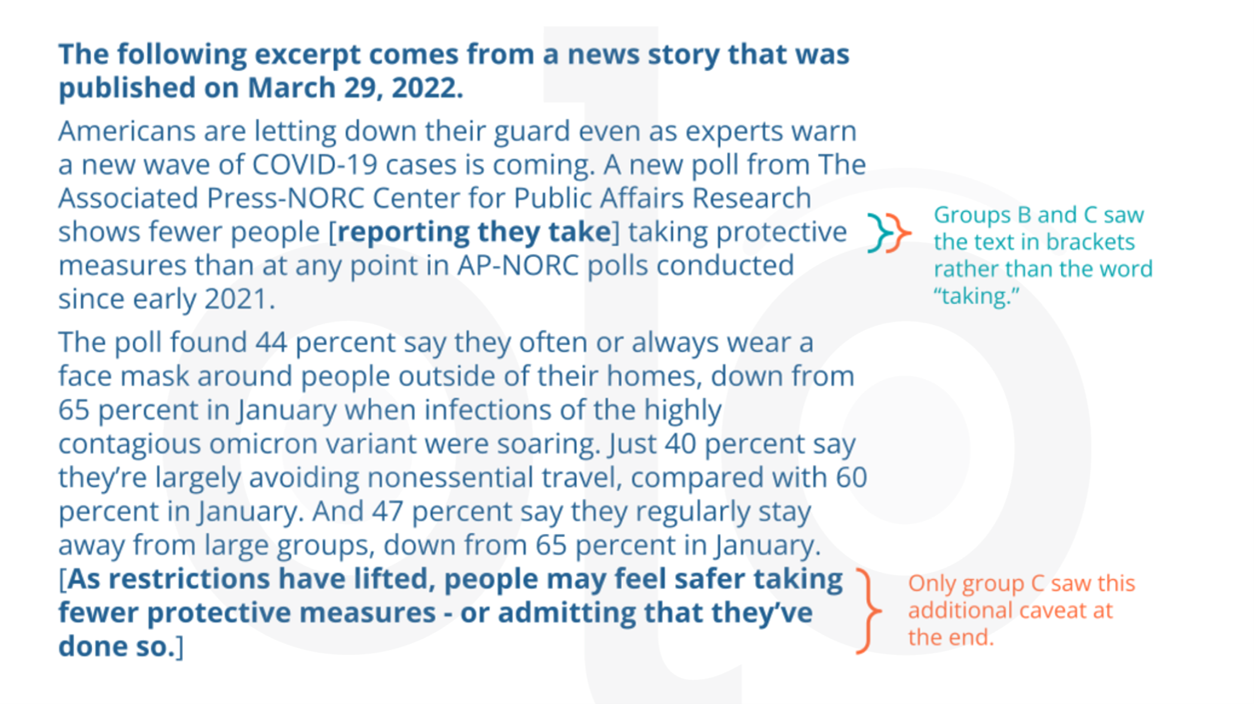 Figure 1. Versions of the story given to the A/B/C testing groups.
Key Findings
Social Relevance & Credibility
As in previous tests, audiences rated the story to be relevant, more so for “society as a whole” than at smaller social scales. In addition to relevance, we asked respondents to rate their reactions to the story they read on a number of scales corresponding to particular aspects of the credibility that respondents ascribe to the data. Neither the social relevance nor credibility ratings varied meaningfully by story version.
Inferences
Comparing Story Versions
We found that regardless of story version, respondents tended to give a fairly wide range of potential values for the “true” percentage of Americans wearing masks regularly. While respondents’ upper bounds were largely close to the reported poll results, even respondents who read the unmodified version of the story tended to give lower bounds that were well below the 65% (January) and 44% (March) poll results reported in the news story. This meant that many responses were not centered around the data presented in the article. All three story versions produced similar estimates from participants, with no meaningful differences in the upper bounds, lower bounds, or range size.
Figure 2 illustrates the ranges estimated by respondents for the number of Americans wearing masks regularly in January 2022. The height of the graph at a given point indicates the percentage of respondents who included this point in their estimated range – for example, more than half the respondents gave ranges that included 65% as a potential value (such as “40-70%,” “50-65%,” or “60-70%”), while fewer than a quarter included 75% of Americans as a possible value.
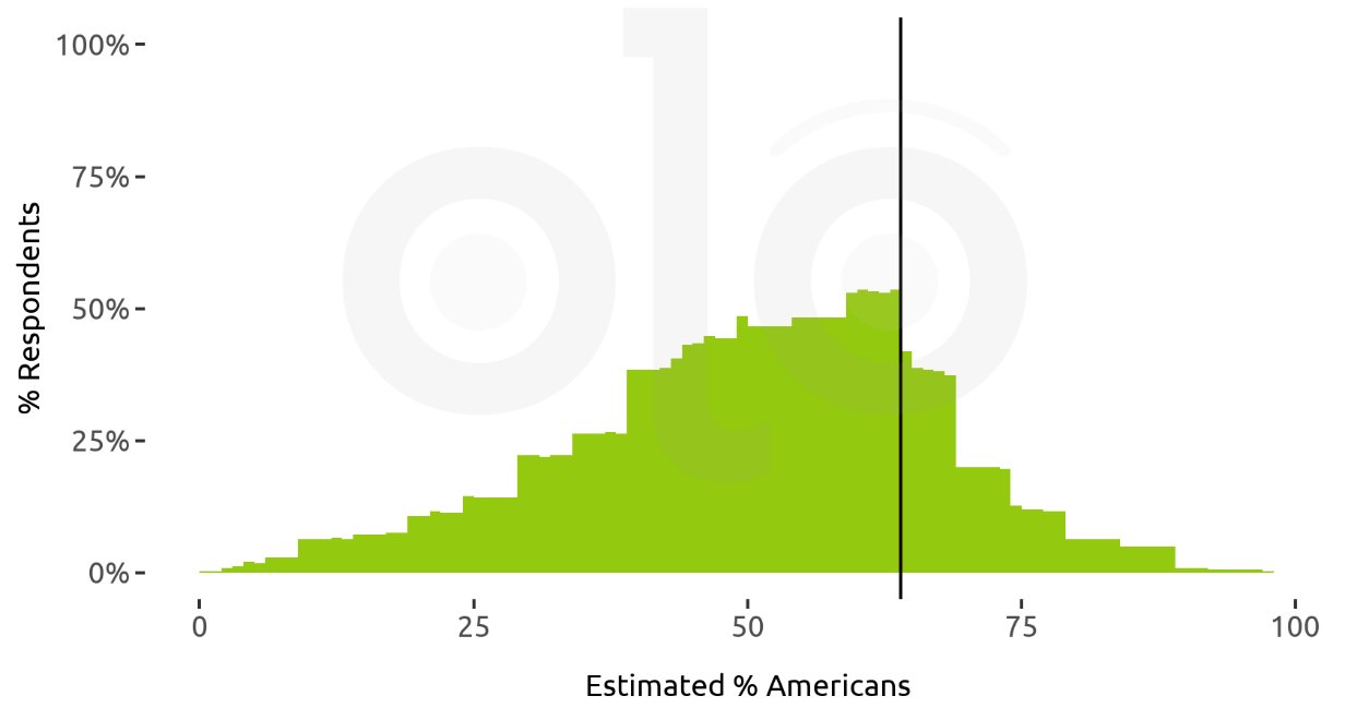
Figure 2. Ranges for “What percent of Americans do you think often or always wore a face mask around others outside of their homes in January 2022?” (n=315)
Note. The vertical line indicates the poll number reported in the story (65% of Americans).
Comparing Reasoning
Respondents gave a wide variety of justifications for their estimates, regardless of the story version they read. More than 130 respondents (42%) said they primarily relied on the article text in giving their answer, while 65 people (21%) indicated that they had considered both the article text and their own personal experience in giving their answer, and 87 respondents (27%) relied mainly on their own observations. For instance, one of these 87 respondents estimated that 20-50% of Americans were wearing masks regularly in January 2022, writing, “I came up with the answers from my own experiences from going outside during the day.”
Out of the 317 people who completed our survey, a total of 28 (9%) explicitly mentioned that they had considered people exaggerating their use of masks when asked in the poll. For example, one respondent wrote “I feel that some amount of people have reported being more cautious than they actually are in everyday life.” The number of people mentioning this did not vary enough by version for the difference to be statistically significant. It is worth noting that some participants estimated the effect of social desirability bias to be quite large. As one person (who read the version with the explicit caveat) wrote,
The last sentence insinuates, and I believe this as well, that these percentages are not 100% accurate because there is still the factor of people being nervous to admit whether or not they are still following precautions. At most, I entered the percentages that I was given. But at least I decided to lower by 20% in order to account for this discrepancy.
However, respondents who mentioned this possibility explicitly were far from the only ones who estimated a negatively skewed population range, with lower bounds far below the poll numbers reported in the story and an upper bound at or near the reported value.
Respondents’ reasoning processes did affect their estimates. Figure 3 shows the ranges estimated for January 2022, broken down into inferences based mainly on the article text, mainly on experience, and a mix of both. March 2022 estimates showed a similar pattern, so we do not provide the visualization here.
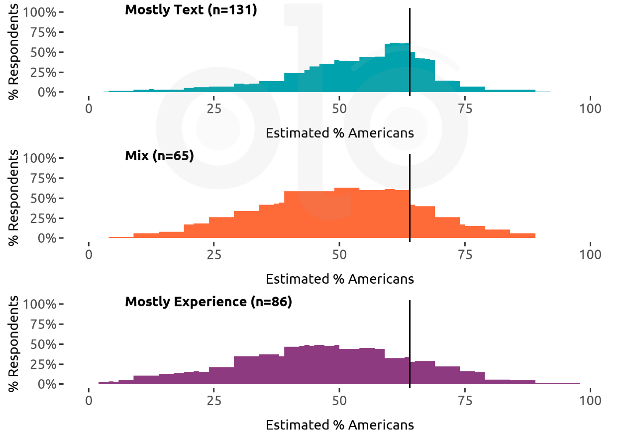
Figure 3. Ranges for “What percent of Americans do you think often or always wore a face mask around others outside of their homes in January 2022?” by respondents, grouped by how they reached their answers.
Note. The vertical line indicates the poll number reported in the story (65% of Americans).
In particular, respondents who relied mainly on the text were more likely to give a smaller range around the poll value reported than those who factored in their life experience, and the center of their ranges, on average, was closer to the poll value. Respondents who took their personal experiences into account were more likely to extend their range lower (around half of these respondents included 40% as part of their range, whereas only around a quarter of “Mostly Text” respondents did).
Of the respondents who relied on the poll, only nine reported the values given in the story as both the upper and lower bounds for the true value. All but two of these nine people made the same decision for both months. Most of our respondents explained that poll numbers are not 100% accurate, and that they had added a margin on both sides of the value reported, or had estimated that the lower bound would be below the number reported. Respondents who relied primarily on the excerpt tended to give narrower ranges than those who included personal experience in their estimate.
Recommendations
- Quantify uncertainty whenever possible. Most people are aware that poll data is not 100% reliable and do not take it overly literally. However, they may overestimate the inaccuracy of poll data. Whenever possible, represent uncertainty in quantitative terms. This includes both margin of error and other potential sources of bias such as social desirability bias. We also encourage journalists to explain indicators of a poll’s reliability, such as strategies used to reduce potential bias.
- Remind readers of variability within the population. People use their own experiences to contextualize and evaluate information they are presented with. If you are presenting a national statistic, adding information on variation across regions may help audiences avoid over-relying on what they’ve seen locally.
Funding
These materials were produced for Meaningful Math, a research project funded through National Science Foundation Award #DRL-1906802. The authors are solely responsible for the content on this page.
Photo by Imants Kaziļuns on Unsplash