Stats Sweep: Change over Time
A deep look at CNN’s reporting on crime polls reveals things to do and not do when reporting on change over time in polls.
At Knology, we’ve thought a lot about the best ways to represent data visually in news reports, and what audiences understand when they see these visualizations. We have also thought a lot about the numbers and statistical information that news reports present. In our research with PBS NewsHour, we’ve looked at how audiences interpret margin of error values and “official” statistics in news reports. Along the way, we’ve seen several examples of data visualizations that we think could be clearer.
In this article, we provide an example of a data visualization from a recent news report from CNN’s Cuomo Prime Time broadcast. This is based on a graphic that appeared on Cuomo Prime Time on June 22, 2021. We are grateful to Katelyn Gadd for calling our attention to it in a Twitter post. In this article, we recommend a different way to show the same data and offer a shortlist of things to do -- and not do -- when creating visualizations about change over time in polls.
A photo of CNN’s Cuomo Prime Time broadcast on June 22, 2021 at 9:32 PM ET
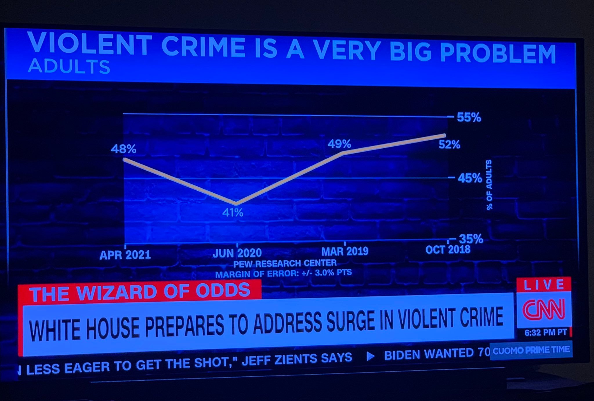
Photo credit: Katelyn Gadd. Chart credit: CNN.
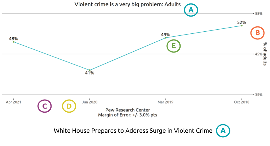
Do This: A better way to present the chart, with annotations
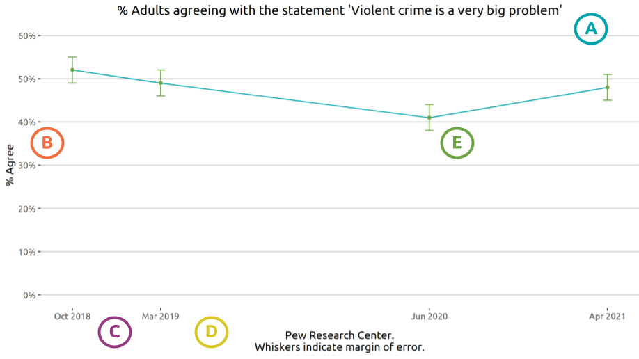
Not This: A reproduction of the chart that appeared on CNN’s Cuomo Prime Time with annotations
A. Title, Caption, or Chyron
DO THIS - Use titles that clearly show what data is displayed in the chart. This chart should be labeled something like “Perceptions of crime are fairly stable over time.”
NOT THIS - Avoid titles or captions that don’t match or misrepresent the data in the chart. The chyron in the CNN chart suggests that data about violent crime is displayed in the chart, rather than public opinions about crime.
Why - Captions shape expectations for and interpretations of the visualization.
B. Scale & Magnitude
DO THIS - Include the range of reasonable possibilities for the things you are measuring when displaying a scale in a chart. For example, percentages can start as low as 0. If you are comparing hourly wages, in contrast, you might set the floor of the chart to be equal to minimum wage since employers cannot pay less than that amount.
NOT THIS - Avoid cropping the axis to make the values appear as though they “bottom out.”
Why - People use the slope of the line in a chart to interpret the degree of change over time. Cropping an axis distorts the differences between values, making it seem like they are faster or more dramatic than they are. However, sometimes it is helpful to zoom in on an important change between values so users can understand differences. If you must crop an axis, you will need to do two things: 1) clearly point out that the chart is zoomed in, and 2) explain why. In the case of the CNN chart, the y axis should probably start at zero. If more of the axis was included, the chart would be clearer that opinions about crime have remained stable over time.
C. Relative Points in Time
DO THIS - Use distances that reflect the relative distance between the time points.
NOT THIS - Avoid using even spacing for intervals that represent different lengths of time. In the CNN chart, the x-axis dates have gaps of 10, 15, and 5 months, but all are an equal distance apart.
Why - The same principle that we saw in scale and magnitude applies here: people use the slope of the line graph to judge how the value changed over time. A steeper line will look like a faster change.
D. Direction of Chronology
DO THIS - Make sure time points are displayed in the conventional order, reading left to right.
NOT THIS - Avoid arranging time points from right to left.
Why - Left to right is the typical reading direction in English, and the default assumption is that time moves forward in this direction.
E. Uncertainty
DO THIS - When possible, show uncertainty in the figure by indicating the margin of error.
NOT THIS - Avoid emphasizing point estimates when there is uncertainty, as points can misrepresent the poll’s level of certainty.
Why - Because no survey can obtain responses from all US residents, there is a degree of uncertainty about what percent of the overall population would give a certain answer. The margin of error gives us a range -- in this case, 3 percentage points higher or lower -- in which the value for the overall population is likely to fall. Ranges can increase and decrease based on the number of people polled. For this data, the April 2021 value of 48% seems lower than the October 2018 value of 51%. But when we look at the margin of error, the ranges are actually 48%-54% of the US population agreeing with the statement in October 2018 and 45%-51% agreeing in April 2021 Since those two ranges overlap, we can’t confidently say there was a meaningful change between the two points in time. Read more about our research on people's understanding of margin of error.
Photo Credit: Markus Spiske on Unsplash.