Number Soup: Case Studies of Quantitatively Dense News
Recent research from Knology and PBS NewsHour looks at how journalists make use of numerical data when reporting on politics, the economy, science, and health-related developments—and makes recommendations for how to do it better.
The contemporary news landscape is full of numbers and numerical data. Whether it be economic news discussing interest rate hikes or stock prices, health-related stories detailing Covid-19 case counts and vaccination rates, or coverage of political developments conveying data from public opinion surveys, everyday media audiences face a deluge of statistical information. Operating under the assumption that numbers “speak for themselves,” journalists who include statistics in their reporting often do so because they think this makes their work more credible.
But is this the case? In our research, which was published in Journalism Practice, we posed two questions:
- What kinds of characteristics do quantitatively dense news stories share?
- What levels of numerical literacy are required to understand quantitatively dense media content?
In connection with these questions, we inquired into the kinds of principles or ideas invoked in quantitatively dense reporting. For example, are news users being presented with comparisons—i.e., numbers showing change over time, or between different places, or between different groups of people? Does the numerical information they confront require an understanding of proportions and percentages, of sampling sizes, or of things like methodological error? Does it traffic in ideas such as variability, probability, or concentration? How quantitatively complex are the numbers-heavy stories people read, watch, and/or listen to, and how much knowledge is required to make sense of these?
For this study, we collected a representative sample of stories from across the US media landscape. February 18 and February 24, 2020, we scraped six stories a day from Google News, focusing on those covering developments in business, science, health, and politics. Some of the stories in our dataset were produced by media organizations with a nationwide reach—like CNN and the Associated Press (AP). Others came from local news outlets like FOX 5 Atlanta. Some of the stories we analyzed came from publications designed for a specialist audience—for example, Bloomberg News. Other stories appeared in general, all-purpose media sources like The New York Times. Some of our data comes from highly partisan publications like The Blaze, and some was produced by organizations without a clear political orientation. To ensure that public media was part of our dataset, we also collected three stories a day in the aforementioned content areas from the PBS NewsHour website.
Our Findings
- The numerical data published in news stories is often highly concentrated, with individual sentences frequently conveying multiple kinds of quantitative information;
- Health and economy stories have more numbers per sentence than politics and science stories;
- Many of the densest pieces come from newswire services (for example, the AP);
- Journalists rarely devote space to explaining or contextualizing numerical content, assuming instead that numbers speak for themselves and do not need to be interpreted.
As an illustration of these findings, consider a story published on February 22, 2020 by the AP. Offering an update on the COVID-19 pandemic (which was, not surprisingly, a frequent topic of discussion in the stories we collected) in South Korea, it began by noting how the country “reported an eight-fold jump in viral infections Saturday with more than 400 cases mostly linked to a church and a hospital.”

In pieces like this, the numbers actually are the story. And as its opening sentence shows, parsing these numbers requires an understanding of multiple quantitative concepts—among them magnitude and scale, proportions / percentages, and comparison (in this case, change over time). Without an explanation of these, it would be easy for readers to misinterpret the data. Even the use of case counts (i.e., the most basic information relayed here) is problematic, as it fails to include information about the number of people tested. Fortunately, since February, 2020, journalists have largely corrected this oversight. Nevertheless, the broader point still stands: *journalists often assume that numbers “speak for themselves.” *
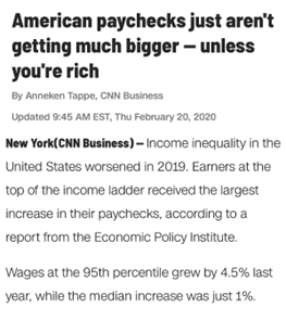
Importantly, this assumption also informed reporting on other content areas. Consider a CNN business report entitled “American paychecks just aren’t getting bigger—unless you’re rich.” In one particularly jam-packed sentence, the report states that “wages at the 95th percentile grew by 4.5% last year, while the median increase was just 1%.” This quantitatively dense statement assumes familiarity with statistical terms like “median,” and also overlooks the fact that some readers might have trouble distinguishing percent increase from percentage point increase.
To be clear, not all news stories are as quantitatively dense as the above examples. Nevertheless, both pieces highlight a common feature of numbers-heavy reporting: the reluctance to provide audiences with the kinds of information needed to accurately understand numbers and statistics. Through our study, we learned that journalists often assume high levels of quantitative knowledge among their audiences. Such an assumption encourages them to take numbers for granted. And the result of this is reporting that is often incomprehensible and easily misinterpreted.
Let’s Put it to Work!
On the basis of our research, we’ve identified several things that journalists and media organizations can do right now to contribute to help the public better understand numbers and statistics. Our recommendations (which organizations like the Nieman Lab have already begun to disseminate) are as follows:
For Journalists
- Write shorter, clear sentences
Instead of producing sentences that employ multiple quantitative concepts, journalists should limit themselves to one concept per sentence. - Add links or insert explainers
Instead of reprinting statistics unchanged, talk about different kinds of statistical concepts. - Provide context for interpretation
What are the methods and principles that are used for statistical data collection and analysis? This is information that media organizations should inquire into, and share with audiences. - Talk about research methods
How do the researchers or government agencies who produce statistical information generate such data? What’s the process of quantitative knowledge production like? What are the different procedures for generating numerical figures? These are questions that media organizations should investigate, and address when conveying quantitative information to audiences. - Be transparent about uncertainty
Rather than providing single-number “point” estimates, report the range of the estimate. This range is called the confidence interval (CI) and corrects for the fact that different samples differ from one another and from the population as a whole. CIs provide a good estimate of the responses that could be expected in the unlikely event that an entire population responded to the same question(s). News users need to know that when it comes to numbers, uncertainty is unavoidable. It’s normal and to be expected—not a sign that something is amiss.
For Media Organizations
- Work more closely with statisticians
By tapping into statisticians’ expertise, media organizations can better understand the kinds of questions (for example, “what do people need to know in order to interpret this number?”) they should ask themselves before relaying quantitative data to the public. - Consider making changes to relationships with newswire content
Some of the most quantitatively dense stories and clauses we examined originally came from the Associated Press and other newswires. Instead of reprinting this content, we would suggest that media organizations modify it, adding explanations or links so that news users can better understand this content.
Funding
These materials were produced for Meaningful Math, a research project funded through National Science Foundation Award #DRL-1906802. The authors are solely responsible for the content on this page.
Photo by AbsolutVision on Unsplash