Numbers in the News: Understanding Estimates
This edition of the Number in the News series studies how audiences interpret the "official" statistics reported in news stories, and the effects of explaining how these estimates are calculated.
Can the news help you learn statistics? In this series of studies, we’re asking people to read, watch, or listen to different versions of a news report that contains numbers, visualizations, or both. Then we’re asking them a series of questions about the credibility of that news report and some of the inferences they make from that presentation. These are the two dependent variables common to all our studies. In addition, we are asking people to assess the relevance of the story topic to four ever-widening social scales: me, my close family and friends, people who live near me, and society as a whole. For details about Numbers in the News and the hypothetical model that underlies this research, click here.
The A/B/C/D Test
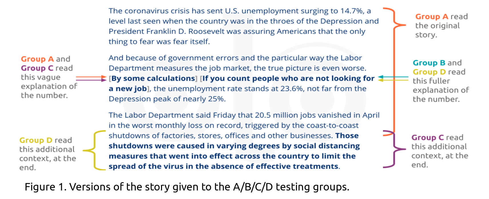
Journalists have been reporting on the effects of the COVID-19 pandemic on the US economy including the job market. For this experiment, we tested audiences’ responses to four versions of a story reporting on job losses due to the pandemic, that included varying levels of supporting detail (Figure 1). All groups read the same “base story”, as indicated by un-bolded text in Figure 1. We also tested three alterations to the base Story A: Story B included an explanation of how the higher percentage was obtained (which was found many paragraphs later in the original story), Story C contained a sentence explaining why businesses shut down, and Story D contained both.
Key Findings
Social Relevance
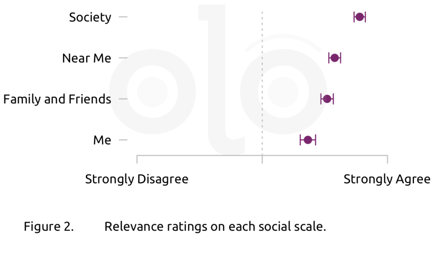
We asked respondents to rate the relevance of the story version they read at four ever-widening scales:* me, my close family and friends, people who live near me,* and society as a whole. Figure 2 below shows the average (mean) relevance rating for each social scale. Participants in all four groups found the story most relevant to society as a whole. That means that judgments about social relevance depended on the respondents, and not the story version to which they were assigned. In fact, when explaining their ratings, all respondents agree that rising unemployment rates and the ensuing economic hardship impacts society as a whole. For example, one respondent wrote, “It doesn't affect me too much as I still have my job and the same can be said for my close family members, but society as a whole is suffering very much.”
Credibility
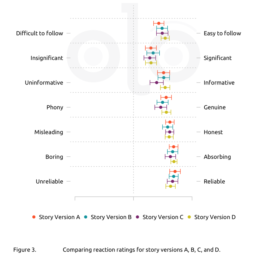
We asked respondents to rate their reactions to the news stories they read. These reactions capture particular aspects of the credibility that respondents ascribe to the stories. Figure 3 shows the average (mean) ratings for each reaction. After accounting for personal characteristics, (e.g., political affinities, judgments of social relevance, demographics, and other variables), there was no noticeable difference in ratings among groups that read the different versions of the story. When we modeled the respondents’ inferences (using the hypothetical model described here) we observed some differences. Among people who read stories B, C, and D, credibility ratings were slightly higher for those who read versions B or D (which explained the second estimate). Overall, respondents who considered the story more socially relevant gave more positive ratings, and this effect was larger than that of the story version.
Inferences
We asked survey participants three questions to understand what they inferred from the information they saw: Which percentage they thought was the most relevant, how serious they considered the level of job loss described, and how confident they were that they understood the causes of the job loss.
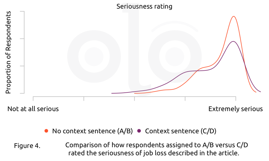
Regardless of story version, respondents rated the job loss described as very serious. People who read the versions of the story (A and B), which did not provide additional context about why businesses shut down, rated the job loss as more serious (Figure 4).
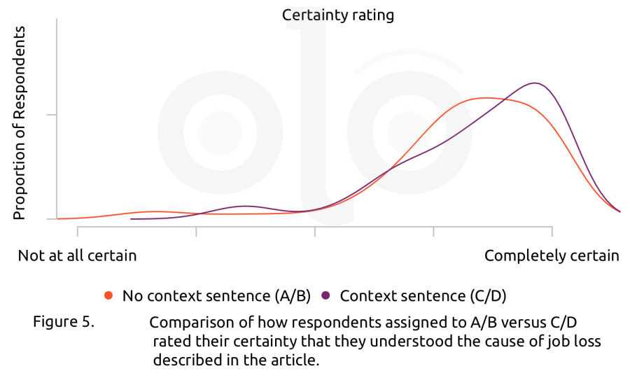
Overall, participants were confident that they understood the causes of the job loss based on the story. In particular, respondents who read Story C or D (which provided additional context about the shutdowns) were more certain about their understanding (Figure 5).
Lastly, we asked respondents which of two competing percentages they found more informative. We saw no meaningful differences between respondents who saw a version of the story that included more details about how one estimate was calculated (Story B and D), and those who did not (Story A and C). See Figure 6.
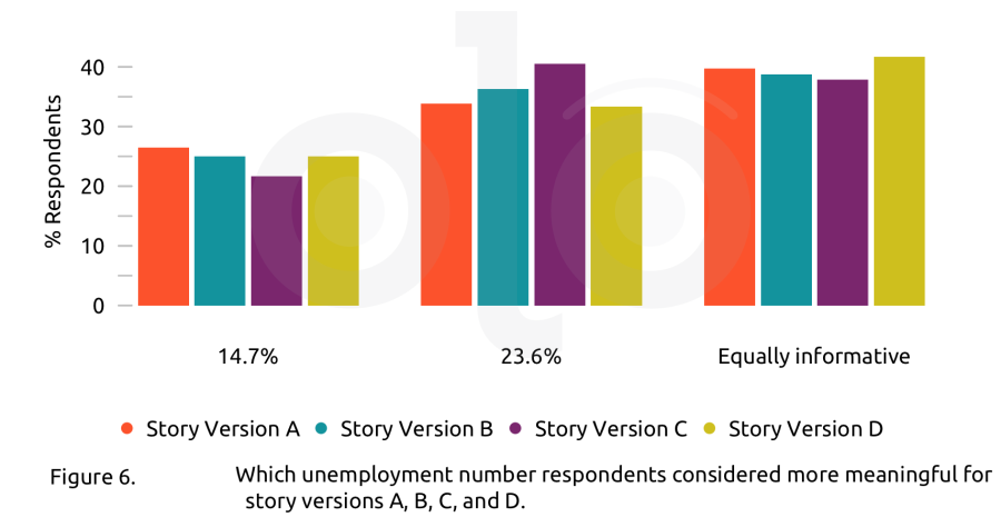
In explaining their ratings, some respondents who read Story A or C (which included the vague “some calculations” language) found that this framing called the reported estimates into question. As one respondent wrote, *“The 23.6% figure is not fully explained. The calculations are not specified. This figure does make the audience think about how much this crisis is truly affecting the country, and I am inclined to believe it, but without explaining how the author got to this number, it is not as informative as the 14.7% figure.“ *
By the same token, some of those who read Story B or D thought that the larger percentage was more informative in part because those versions provided more context about how it was calculated and who was included. Those arguments were sometimes grounded directly in the text, but some respondents built on prior knowledge, writing about groups like freelancers that were not mentioned in the excerpt.
It seems that choosing the “equally informative” option represented two different responses: some respondents pointed out ways that each number makes a different (useful) point, while others said they were unsure how to judge which number was more informative. A number of responses pointed to a lack of understanding of how official statistics are calculated and what they represent. Many of these respondents wrote that 23.6% was “an estimate” or “speculative” or “a projection” in contrast to 14.7% which was described as “solid,” “official,” or “actual.” In other words, these respondents did not recognize that official statistics are themselves estimates and not exact counts.
Recommendations
- When reporting on statistics, providing detailed context helps audiences understand the numbers better. Details should include how the numbers were generated and who performed the calculations, as well as what was and was not included in the calculations.
- Reporters should clarify for audiences that all statistics, whether from "official" or other sources, are estimates of the facts on the ground.
Funding
These materials were produced for Meaningful Math, a research project funded through National Science Foundation Award #DRL-1906802. The authors are solely responsible for the content on this page.
Photo credit: Amit Lahav on Unsplash.